
Graphical UI's with SVG and React, part 1 - Declarative Graphics
React and SVG make a powerful combination: Declarative UI component library meets declarative graphics language — a match made in front-end developer heaven.
In this mini-series we’ll be looking at rendering interactive graphical UI’s using components built with React and SVG.
These days SVG icons are ubiquitous, but those are not the sort of components we’re talking about.
We’re going to put together the interactive floor-plan UI using simple React code that renders SVG elements instead of HTML. We’ll take it relatively slowly, building through the basics into more advanced topics.
- Part 1 — Declarative Graphics (this post)
- In which we look at the match made in heaven that is React and SVG
- Part 2 — Arcs, Angles, and Transformations
- Keeping geometry simple with groups and transformations
- Part 3 — Clip-paths
- An adventure in composite geometry
- Part 4 — Masks
- When clip-paths don’t cut it: masks to the rescue
- Part 5 — Animating components
- Where we animate individual components
- Part 6 — Animating the viewBox
- In which we fluidly zoom and pan our entire UI
Let’s dive straight in!
Declarative Graphics
React developers enjoy first-class support for HTML elements in JSX:
const SomeComponent = () => (
  <div>
    <p>hi!</p>
  </div>
);
But did you know that this applies to inline SVG elements too?
const SomeOtherComponent = () => (
  <svg viewBox="0 0 100 100">
    <circle cx={50} cy={50} r={30} fill="red"/>
  </svg>
);
Out of the box we can write components that compose SVG primitives to create complex interactive UI’s, just as you would with more typical HTML based components.
(Note for React-Native folks: you’ll need to install react-native-svg, which was looking pretty good last time I worked with it. Here is a simple but pretty powerful example I created a few years ago.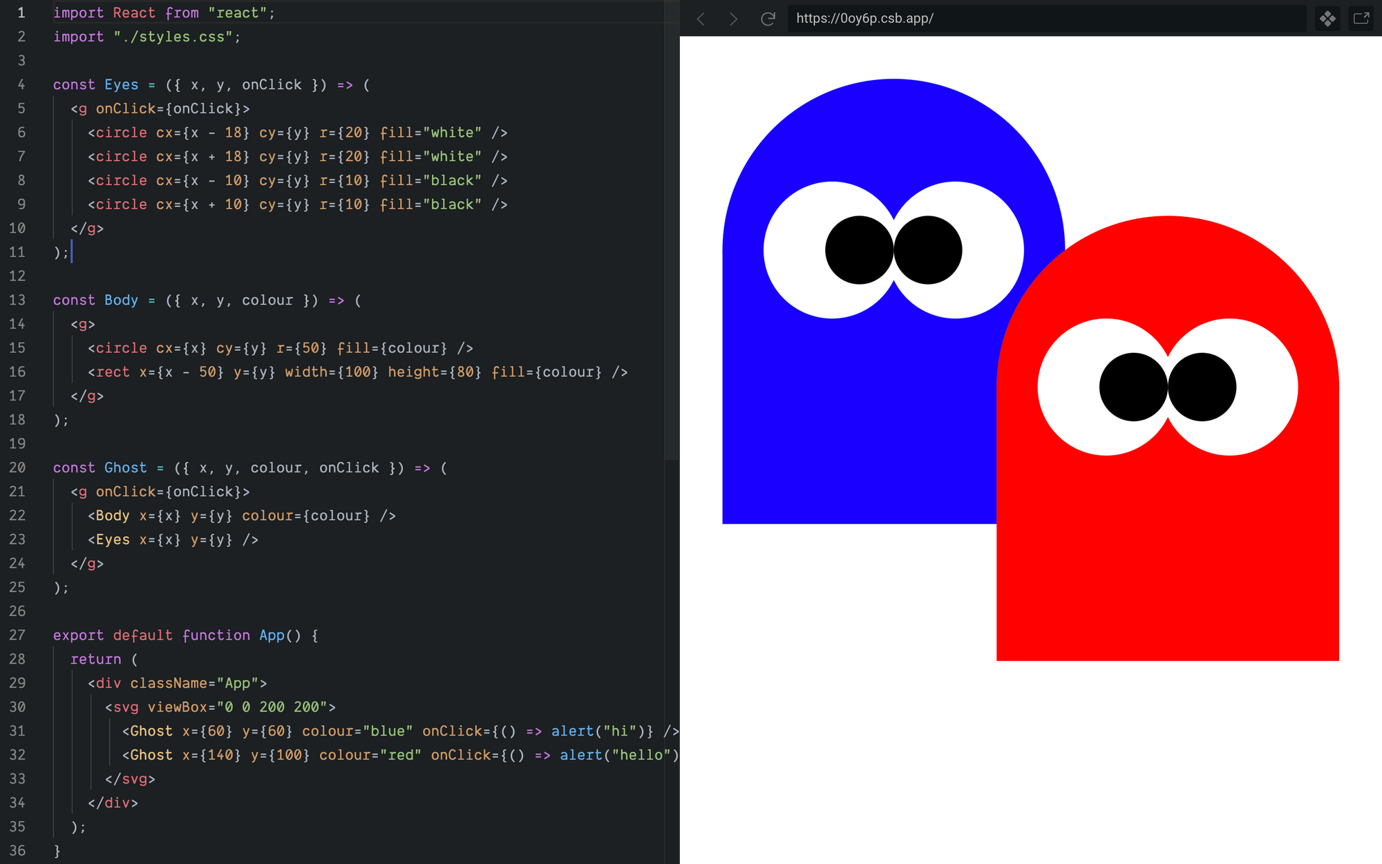
Simple composition of declarative graphical components (https://62zqd.csb.app/)
Notice that we did all this drawing without a single line of imperative code, and the declarative markup of our ghosts is very readable and accessible to anyone familiar with React — a far cry from what this would look like if we tried to do it with the Canvas API.
All your elements are belong to us
To draw anything with SVG, we first need an <svg>element to define the drawing context within which all descendant elements are rendered.
We can have many <svg> elements in our page, each describing an isolated drawing context — e.g. one <svg> per icon, chart, or other snazzy graphical widget.
Alternatively, we can root many graphical components within the same <svg> and create an entire UI in a single drawing context.
Viewport and ViewBox
At a minimum an <svg> element should specify how much screen-space it will occupy — its viewport. This can be done with CSS styles or width and height attributes.
<svg width="200px" height="200px">...</svg>We’ll typically want to specify a viewBox too, to explicitly define the “user-space” portion of our drawing that is made visible in the viewport.
Think of the viewport as a window into the world defined by the SVG (“user-space”), and the viewBox as zoom and pan settings that control what parts of the user-space you can see through the window.
The viewBox attribute is a string which specifies, in order, the user-space x and y coordinates of the top-left visible corner, and the width and height of the viewBox.
<svg viewBox="x y width height">...</svg>For example, “-100 -100 200 200” describes a square viewBox 200 units high and 200 units wide, centred around the origin at (0,0).
<svg width="10" height="10" viewBox="-100 -100 200 200">...</svg>If we don’t specify it explicitly we get a viewBox that maps width and height 1:1 to the viewport, with the user-space origin (0,0) at the top-left corner.
To re-iterate: the viewport describes how much space the <svg> element takes up within your HTML page. The viewBox describes the portion of the image that is visible within that viewport. By changing the viewBox we can zoom in or out, or show entirely different portions of the SVG image.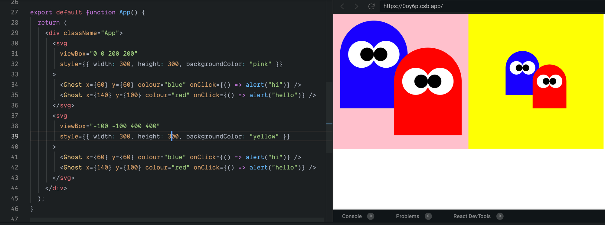
The only difference between these two SVG’s is the viewBox and the background colour (https://0oy6p.csb.app/)
If the proportions of your SVG viewport in pixels don’t match the proportions of the viewBox, the default behaviour is to preserve the aspect ratio and centre and fit the viewBox within the available viewport. This behaviour can be controlled by varying the preserveAspectRatio attribute.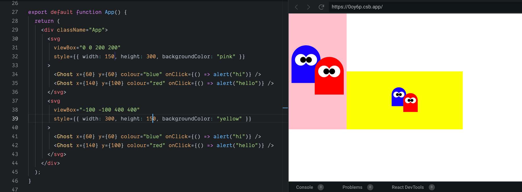
By default the viewBox will be centred and “fit”within the SVG viewport (https://52fbc.csb.app/)
The separation of coordinate systems between the viewBox and the viewport means that within our SVG we can work with coordinates that makes sense for our specific drawing.
For example, if we’re drawing an interactive widget we can make the maths easy for ourselves by working in percentages and specifying a viewBox of “0 0 100 100”.
Or if our widget has radial symmetry and we want to easily draw from the centre, we can use a viewBox of, say, “-50 -50 100 100” centred at the origin (0,0).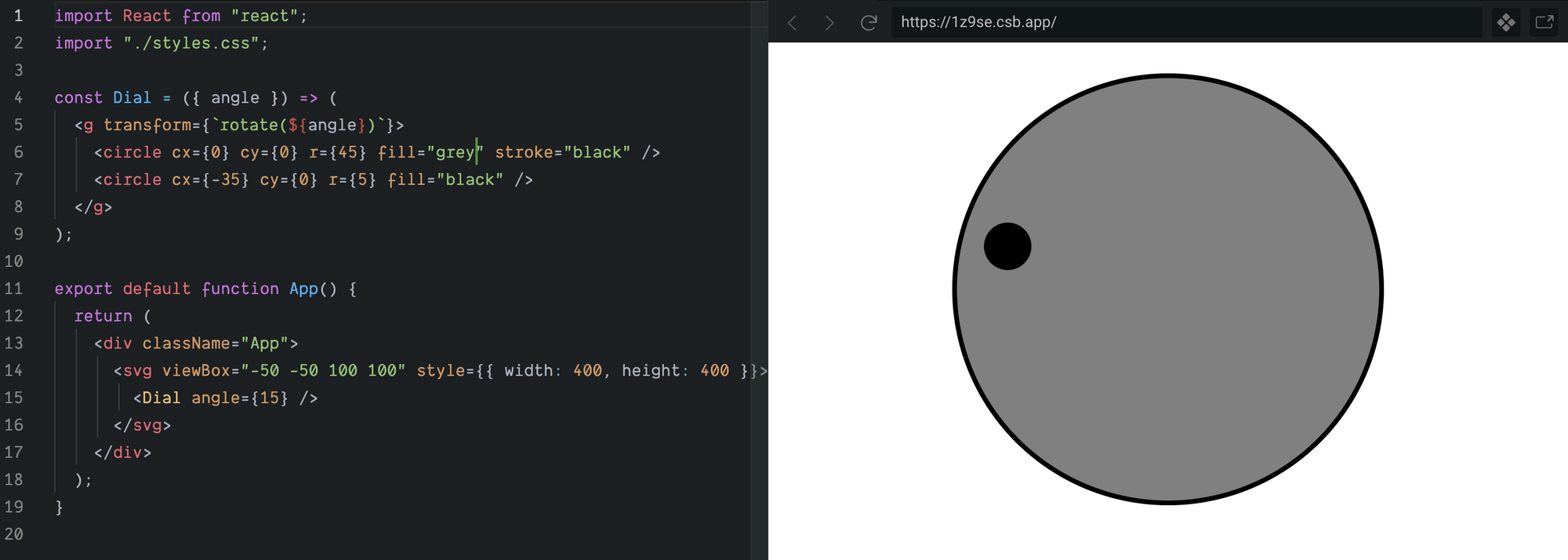
In this series we’ll be drawing floor-plans, so we could choose to work in metres, or feet-and-inches, or whatever system of measurement our plans use. We’re actually going to use millimetres, just for the simplicity of working in whole numbers.
We’ll describe our floor-plan with some simple JSON, specifying the room geometry as coordinates of corners working clockwise around the room.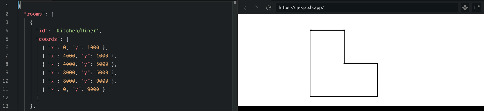
Now we can set up our viewport and viewBox, allowing a little padding around the floor-plan so it isn’t too snug in the viewport.
import data from './floorplan-data.json';
const App = () => (
  <svg
    width="500px"
    height="500px"
    viewBox="-1000 -1000 14000 11000"
    style={{backgroundColor:'blue'}}
  >
    // ... floorplan components here ...
  </svg>
);
With our viewport and viewBox sorted, we can get on with drawing.
Declarative Drawing Primitives
SVG includes a number of drawing primitives ranging from the simple <line> and <circle> to the more flexible <path>. Mozilla Developer Network has a good reference of the available elements.
Shapes can be filled and/or stroked, where fill is the colour applied within the bounds defined by the shape, and stroke is the colour applied to the outline of the shape. The width and other styles of the stroke can be controlled with attributes or CSS.
We’ll be drawing our initial floor-plans using two simple primitives: <line> and <circle>.<line> describes a line between a pair of (x, y) coordinates.
<line x1={100} y1={100} x2={200} y2={200} stroke="red"/><circle> describes a circle of radius r centred at (cx, cy).
<circle cx={50} cy={50} r={20} fill="green" stroke="black"/>Room with a View
To draw our building we’ll pass the data into a Floorplan component which will render out the various elements of the floor-plan — initially just the rooms.
const Floorplan = ({ data: { rooms } }) => (
  rooms.map(r => <Room {...r} />)
);
For the Room component to draw the walls we’ll need to map over pairs of consecutive corner coordinates, linking them together to form walls. For example a rectangular room with corners a, b, c, and d, will have four walls (a-b),(b-c), (c-d), (d-a).
We can pull out those pairs with a simple function, perhaps wrapped in a useMemo hook for efficient re-renders.
const walls = useMemo(() =>
  coords.map((_, i) => {
    const a = coords[i];
    const b = coords[(i + 1) % coords.length];
    return [a, b];
  }),
  [coords]
);
Now drawing the walls is as simple as using the SVG <line> element to describe a line between the pairs of connected corners.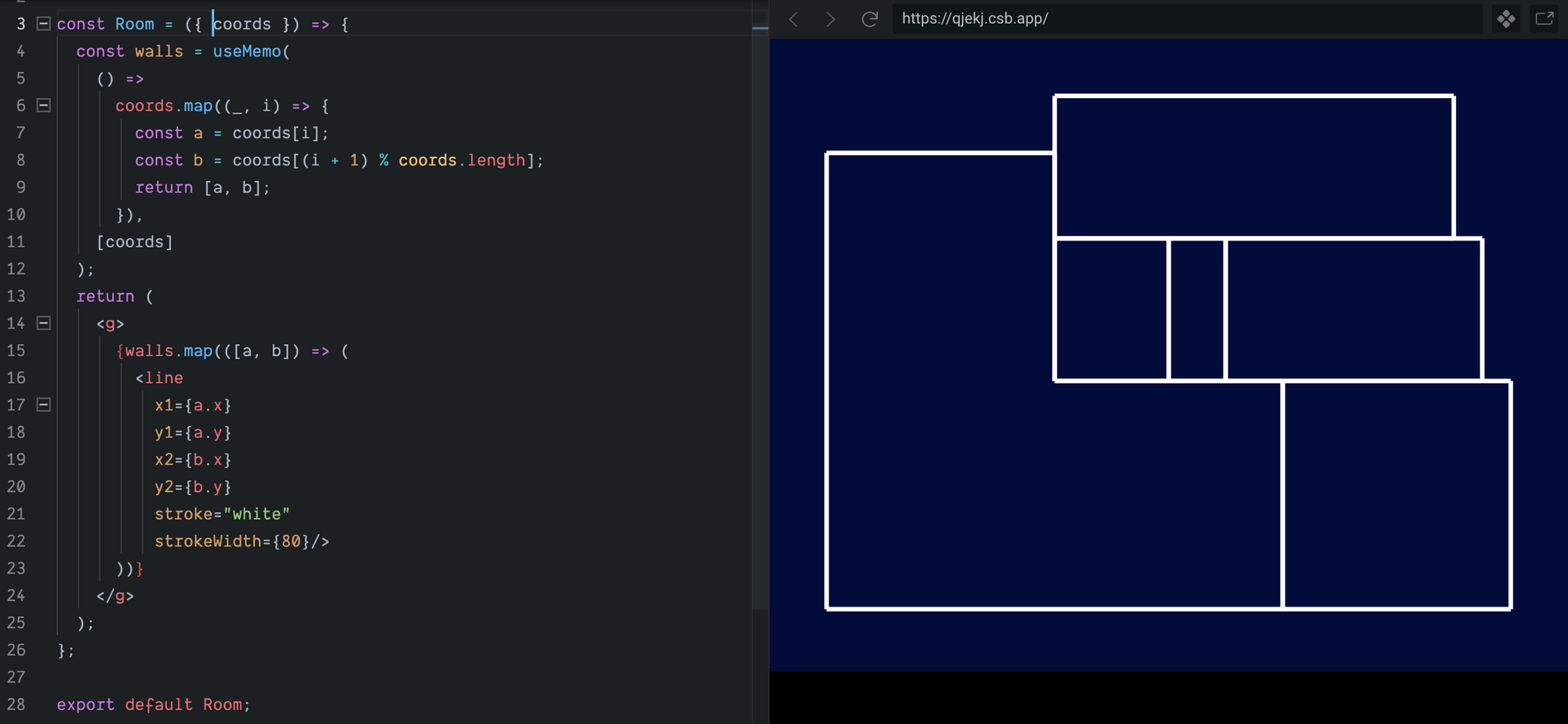
That works, but it isn’t very pretty. Let’s extract a Wall component and a Corner component, and get a bit more creative.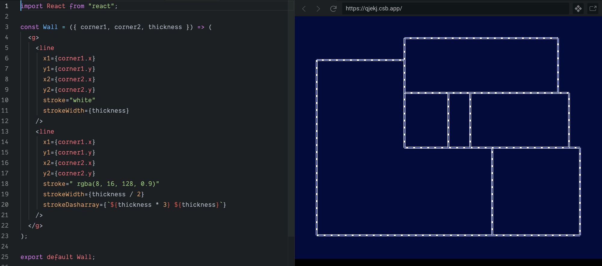
In our wall component we’re now drawing two lines per wall — first a thick white line, then over-drawing the white line with a thinner, dark blue, dashed line.Corner is very simple — just a circle, stroked white and filled dark blue.
The Room component now simply composes these higher-level Wall and Corner components instead of SVG primitives.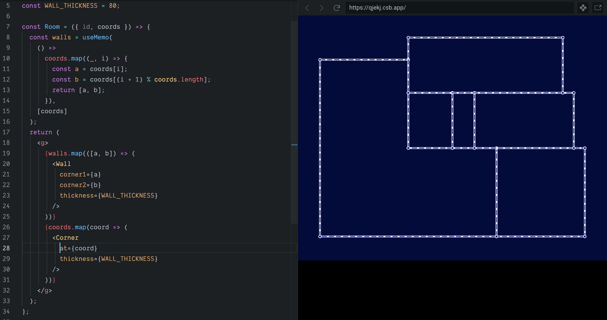
https://codesandbox.io/s/react-svg-basics-rk1t3
You may have noticed that we nested our Walls and Corners in an SVG <g> element. This is a logical grouping element — the <g> on its own doesn’t render anything visible — but it does give us a neat way of performing transformations such as rotations and translations on entire sub-hierarchies of our SVG, and a means of capturing events from those sub-hierarchies by attaching event handlers to the <g> element.
Recap
In this post we saw that:
- We can easily draw arbitrary shapes using SVG primitives and straight-forward, declarative React code — no plugins, libraries, or imperative code required.
- Complex graphical UI’s can be built by composing together increasingly higher level components, just like any other React application.
- The separation of viewBox and viewport lets you draw in a coordinate space that suits you, then render the result in a viewport appropriate to the final display requirements.
In “Part 2 — Arcs, Angles, and Transformations”, we’ll dig further into those <g> elements and look at paths and transformations while adding camera’s to our floor-plan.
Until next time, happy drawing!